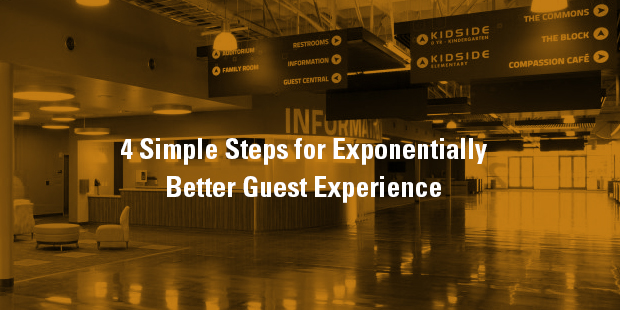
4 Simple Steps for Exponentially Better Guest Experience
What would it look like if this coming Sunday morning, your church’s entire Guest Services Ministry Team didn’t show? Imagine no neon-vested minions directing traffic or over-caffeinated greeters guiding guests. I wonder if the scene might border on apocalyptic, with panicked pastors pacing the hallways, pandemonium in the parking lot and zombie-eyed parents with kids in tow left to fend for themselves?
What if you were forced to rely solely upon your facility’s design to guide each guest?
Think about it: could every visitor flawlessly navigate an entire Sunday morning experience intuitively or would the self-guided experience result in a blundered debacle? And what happens to those people, often first-timers, who want to navigate your building on their own and manage to skillfully evade your welcome team each week? You know it happens.
Here’s the cold hard truth: if newcomers are unable to intuitively navigate your facility, it indicates you’ve got a huge design problem on your hands. Because good design always makes usability more intuitive. And intuitive environments empower great guest experiences.
Often, churches use their guest services ministry as a duct tape to patch the holes of defective design. It’s true– your building may need a complete overhaul. But maybe you could begin to curate a better guest experience now by making your building a little more intuitive.
HERE ARE FOUR OF THE MOST BASIC RULES TO CURATING A MORE INTUITIVE GUEST EXPERIENCE:
1. POINT THE WAY
Thoughtful “way-finding” and quality signage is absolutely the best way to curate a more intuitive experience. Clear and strategic directional signs that guide and move people through ministry environments will empower guests to take control of their own spiritual experience from day one.

Keep in mind that “way-finding” doesn’t always demand a huge ugly directional sign mounted to the wall. Sometimes, the best label is a strong branded space that intuitively directs your guests. For example, your main entry door should be unmistakable – no sign required. Four-year-olds should intuitively know where they belong and be naturally drawn to your kids’ environment.

2. SIMPLIFY THE OPTIONS
Some of the best apps on your phone only contain 2-4 buttons on your screen at a time. The app may organize the library of a billion songs, yet there are still only 2-4 choices available. Simplicity is what makes complexity usable.
The parking lot is a great place to begin thinking about simplifying the user’s options. Add a dozen orange cones to reduce a driver’s turn choices and forge a unified traffic flow (and for the record, the need of traffic cones could indicates poor parking design).

3. DEVELOP MINISTRY DISTRICTS
Another way to simplify complexity is to consolidate what you have. Think about it, grocery stores group all of the dairy, meat and bread into their own individual districts. It’s what makes finding hamburger so intuitive. Home improvement stores have both plumbing and painting districts. It’s even likely that your socks and jeans don’t live in the same dresser drawer but have their own “districts.”
If you want to make your building more intuitive, then your ministries should also be grouped into similar districts throughout your building. For example, children should all be together in their own secure district that is visually differentiated from all the other parts of the building. Additionally, there should be a youth district, worship district, admin district and connecting space.

4. FAVOR CLARITY OVER CREATIVITY
Guests crave simplicity and clarity. So, for heaven’s sake, make sure the names of your environments actually describe what they are. As a guest, I just want to know where the coffee is and where to drop off my kids. So when you use the greek word for “coffee” to name coffee corner or some creative nonsensical jib jab to brand your kids check-in, it’s not helpful (even though it may be super creative).

Know where to get creative and where to use common sense design patterns. And when it comes to creating intuitive spaces, always favor clarity over creativity.

Tags: Dave Milam, Guest, Visioneering, Wayfinding


