An Architect’s Secret Weapons: Color
What turns a building into a work of art? What makes good architecture stand out from the masses of boring buildings? These are all questions of opinion. Most people don’t know the answer to these questions, but they know a good building when they see it. They may not know why they like it, or what specifically makes them like it…they just know it’s good.
This next series of posts is going to discuss some of the secret weapons in the architect’s arsenal to pull off great designs. The exciting thing I’m going to share about each of these is also that they can all be done without busting the budget…in fact this first item probably gives a project more bang for the buck than anything else you can do.
What is this ultimate secret weapon? Color. Yep, that’s it, simple color.
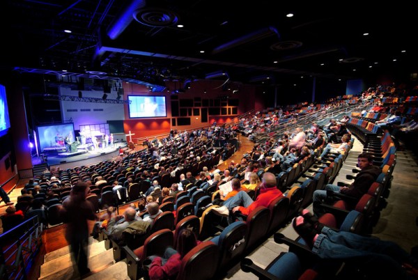
Central Christian Church – Beloit, WI. Photo by PlainJoe Studios.
Since my company, Visioneering Studios primarily works with churches, I’m going to aim most of this discussion in that direction. Your typical church architect faces a dilemma when it comes to color…the church building committee. There are usually two outcomes from this dilemma, neither of which is good. Result 1: the building committee doesn’t want to “offend” anyone with color so you get three shades of gray, white and beige throughout the building. Result 2: the building committee lets everyone have an opinion and they pick 325 colors that don’t match with anything.
Nothing changes a room, a building, or an environment as quickly as good color selections. Look at the ads in any magazine (especially architecture or interiors magazines), or just pay attention to the “rooms” shown on any TV show or commercial. You may have never noticed them before because they are usually the “backdrop” for the product being sold or the entertainment show you are watching. But if you pay attention you will find a carefully coordinated and selected color palette in every environment, not plain white, not wildly clashing colors, but complementary, well-orchestrated colors and textures.
Color can set moods. Color can create environments that can be bold and playful, elegant or rustic, comfortable and uplifting. Your project can have so much more impact if you find a good interiors person and allow them the freedom to infuse color into your building (inside and out!).
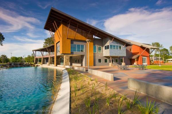
Northside Christian Church – Spring, TX. Photo by G. Lyon Photography.
On your next project, turn color loose and don’t be afraid to let your interiors person fill your building with a palette of perfection. After all you have to paint every surface or have some finish on it anyway. What other material could you select that doesn’t affect price? Maybe it costs you a few hundred dollars extra for a little more labor “cutting in” between the colors and having to buy smaller quantities of multiple colors instead of one big batch of “white”, but where else could you get more bang for your buck on your next project? Give it a try. You won’t regret it, but even if you do, you can always go buy that “white” paint and have a painting party.
Do you have a favorite building or room? I bet it’s not plain vanilla! Share a link to a picture of it with us by leaving a comment below.
Read more from Jody here.

Tags: Color, Jody Forehand, Physical space


