Multisite Church Website Approach 1: Keep It Under One Roof
Multisite church planting has gone mainstream. As goes the church, so goes the website. We’re going to go in-depth with the Universal Website with Multicampus Information approach.
As we stated in the introduction to this series, the advantage to this type of site is having all the information under one digital content roof. It works extremely well in densely-populated areas where events throughout the week are available to all and are less campus dependent.
In most cases, the reasons for going multisite revolve around cost efficiency to broaden reach. Why have people drive 30 minutes to a campus when they can drive five and bring more of their neighbors with them?
If, however, a church is in a densely populated area, and mass transit is readily available, the geographical area to work within is much smaller.
Mutlisite communities like this can “blend together” without the need for developing separate identities for each campus. A member might participate in the men’s ministry at one campus and worship at another. Why? The campus for men’s ministry is closer to their work and the worship community campus is closer to their house. Convenience plays a larger factor in church attendance than most would care to admit.
Here are a few examples to consider as you map out your multisite website. While these churches are located in larger population centers, this approach can also be adapted for smaller communities. (For instance, The Leadership Network released a survey that said the median size today for a multisite church is 1,300 attendees.)
Park Community Church – Chicago, IL
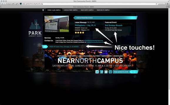
When you click the campus links at the top of the page, Park Community Church shows you a “snapshot” for each location.
Each site displays the latest message, a featured event, contact information, and physical address. Great for gauging which location is most relevant for the user.
Redeemer Presbyterian Church – New York City, NY
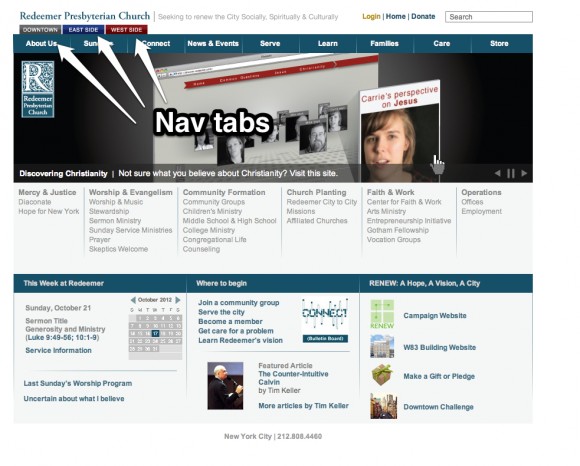
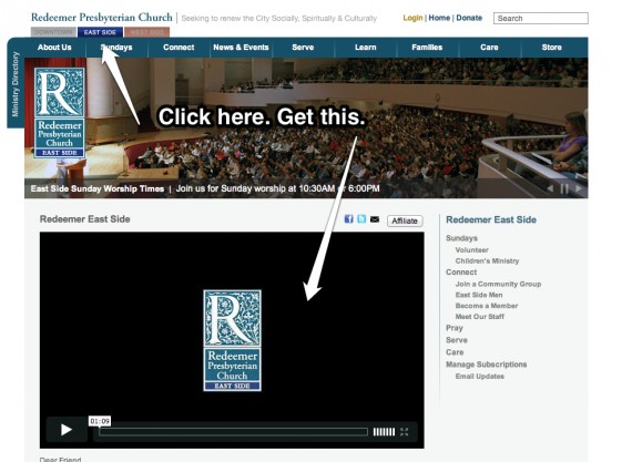
Redeemer Presbyterian gathers all of their campus information onto one main site. The upper left corner allows users to sift through content for each campus using tabs. The benefit of this approach having all church-related content under one “roof.” The URL is fantastic as well!
Woodlands Church – Woodlands, TX
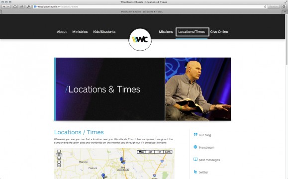
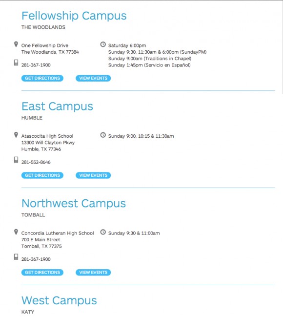
Woodlands Church lists all of their campuses on one page, giving the addresses, phone numbers, and service times for each location.
Once you’ve located a campus that works, you can view the events for that location. Best feature? The ability to filter events by ministry areas. This approach keeps users in one location, cutting down on distraction and location confusion.
Conclusion
If you’re looking for an easy to way to start with a multisite church website, this approach may be best for you. Leave the microsite and stand-alone site planning for later.
Read the Introduction to this series here; read Part 2 here.
Read more from Justin here.

Tags: Attention, Awareness, Brand, Justin Wise, Multisite, website


