An Architect’s Secret Weapons: Environmental Design
Do you know what environmental design is? If you’re not in the “industry” you may have never heard that term, but if you’re a living, breathing American and aren’t living under a rock, then you experience it everyday when you go out in public. Environmental design is a broad discipline but at its core (when discussing built environments) it is a key element in transforming a building into an experience. Every store, restaurant, cool night club, theme park, and museum you’ve probably ever visited uses environmental design at some level to immerse you in their brand.
Environmental design typically incorporates graphics, theming (whether 2D or 3D elements) and signage to carry forward the brand or tell the “story” of the space. Retailers get it, and they know how important it is to create an environment that transforms the simple act of shopping into an immersive experience, even though many of the “shoppers” don’t realize this subconscious manipulation is happening to them. They just think, “What a cool store!”
At Visioneering Studios we are working with churches and other clients across the country helping them figure out what their unique calling is and how to communicate their mission to the community through their built environments. We want the design of the site and the buildings to speak to this, and good design does achieve that goal. It’s easier to do this when you design extremely expensive buildings, because you can literally sculpt the building to the desired effect (just see these buildings by Santiago Calatrava or Frank Gehry as examples).
However most clients, and especially churches, don’t have an unlimited budget, so a creative architect must find other ways to achieve that result. Learning lessons from retail, you can take a big, dumb box (like a pre-engineered structure or a simple architectural form) and spend your money on creating specific architectural elements to emphasize the entrance, which then makes the big box just fade into the background as the canvas for your design. Now you’ve got an architecturally interesting entrance and have saved your money by not having to make the entire building an expensive piece of art. To take it to the next level the architect pulls out the third secret weapon…environmental design. (If you missed the first two, you can find them here: weapon one – Color; and weapon two – The Space Between Buildings.)
Now we are able to use screening elements, changeable print and digital graphics, signage, and props to provide some excitement to the building. It doesn’t matter whether it’s interior or exterior, and elements can be designed for installation on almost any surface including portable kiosks, walls, doors, glass, or fabric. This gives you tremendous flexibility and allows you to “tell your story” or communicate your mission or brand to everyone who passes by or stops in, even when nobody else is around.
We achieve this by partnering with environmental design firms like PlainJoe Studios. As either the architect or design-builder on a project, we work closely with the environmental design group during the design phase to integrate their environmental design elements into our architectural and interior design plans to help create a cohesive, multi-sensory experience. The next time you go visit your favorite store or restaurant look around. You might not have noticed the lifestyle graphics on the walls, the branded signage, or the theming elements and dimensional props before, but I bet you will now. Now visualize that same store or restaurant without those elements. It wouldn’t be the same experience would it?
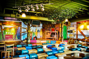
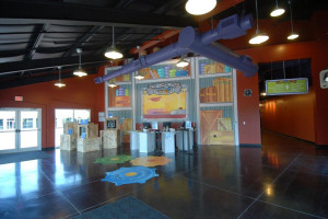
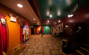
Below are a few more examples of some projects we have done with PlainJoe Studios for various churches across the country. Could your church use a make-over? It doesn’t have to be expensive. Groups like PlainJoe Studios can tailor their custom graphics package to meet whatever budget your church or organization establishes, and a good environmental graphics package can typically be provided starting at just a few dollars per square foot. Obviously you could spend a lot more than that too, but you don’t necessarily have to in order to get some big impact in key areas of your facility. Good design and creative environments are inviting and make people feel comfortable. So, who wouldn’t want to make a good first impression on visitors before they even have a chance to meet your people or hear your message?
So which one of these environments do you like best?
Read more from Jody here.
Check out Visioneering Studios here.

Tags: Environmental Design, Jody Forehand, Physical space, Visioneering Studios


