Understanding Trends in Church Websites: Mobile First is Growing
If you wanted to predict the future of the web, how would you go about doing it? Further, what if you wanted to know how people accessed and utilized their church’s website?
For starters, you take a look at the hard data. We’ve been collecting data on 50+ churches for over three years and the data, dear friends, is astounding. If I told you everything we’re uncovering through these analytics, your head might explode.
But, not one to disappoint, here’s a peek into where we’re going.
We wanted to know, with a degree of certainty, what the trends were surrounding church websites. Take viewing location, for instance. The data we’ll be looking at in this post measures four areas:
- Mobile
- Computer
- Tablet
- Others
Here at Monk, we’re definitely seeing a trend with churches wanting to design for mobile-first. We worked with The Village Church recently to create a site-wide responsive design. If you’re not familiar with responsive, it means a website is “aware” of the type of browser it’s being accessed on—mobile, tablet, or desktop—and “responds” accordingly.
(If you want to see responsive in action, go to Village Church’s website and adjust the size of your browser window. Watch the images move! This is responsive design in action.)
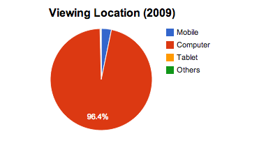
The trends towards mobile comes with good reason and concrete data. Here’s what our stats show: Nearly 97% of users accessed their church’s website via desktop in 2009:
Keep in mind, this is only four years ago. Barack Obama was still a new President and poor ol’ Tiger Woods announced an “indefinite leave from professional golf” to work on his marriage. Seems like it was just yesterday but, of course, it wasn’t.
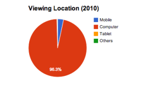
Our online viewing habits have changed significantly since then. Here’s how users accessed church websites in 2010:
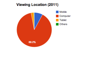
It isn’t a big change, but the divergence from desktop was just beginning to pick up steam. Keep in mind the first iPad was released in April 2010—a stake-in-the-ground moment for mobile/tablet usage. Here’s what the same chart in 2011 looked like:
Desktop usage by church website users decreased 7.5% from 2009 to 2011. Desktop usage decreased another 1.7% in 2012, thus solidifying the downward trend for desktop internet use. Desktop is out. Mobile and tablet use is in. (Maybe that’s what led Google to declare “desktops will be irrelevant“…by 2013.)
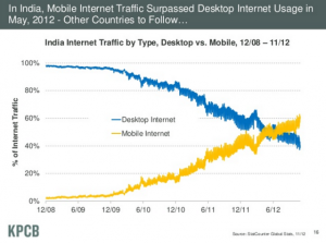
Look at mobile-savvy cultures like India to see where the U.S. is headed in terms of website usage. According to Mary Meeker’s research, India become a mobile-first country in May 2012. for the first time in history, more people accessed the web in this country via mobile than did desktop.
This is not insignificant.
As the slide states, many more countries will follow. So will many churches. Organizations must begin considering a mobile-first environment. This can be especially daunting for churches who still wrestle with the purpose of their desktop-based website.
Conclusion
The data I’ve presented here is a small snippet of what we’ll be covering in our yearly “State of the Church Online” report, due out the end of this month. You can get early access to the report by joining our mailing list here.
Read more from Justin here.

Tags: Attention, Brand, Justin Wise, Social Media, website


